

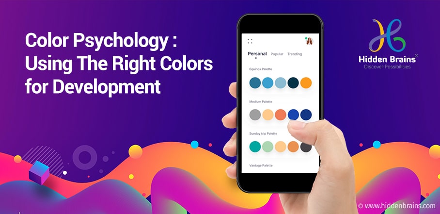
Color Psychology In App Design
Drive user engagement with colour psychology an effective method driving engagements beyond interfaces, user flows, and copy.
Colors have an enhanced effect on human perception, preference, and psychology throughout their lifespan. The choices about color can be observed in infants as young as three months old and typically change with age.
A few responses to color are innate, and some are learned from nature or culture. For instance, cool hues act as relaxants and are generally preferred over their more warm counterparts.
Source: Colorpsychology.org
The relationship between humans and colors has been around for eons, making it a worthy asset for any visual communicator.
Understanding the Basics of Color Theory to Select Right Colour for your App
The Colour Theory
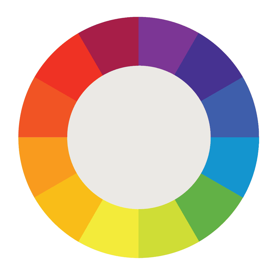
Let us understand this fundamental first. In color theory, you will find that the colors are organized on a color wheel and grouped into the three most fundamental categories: primary colors, secondary colors, and tertiary colors.
Color theory helps entrepreneurs build a strong brand. And this color theory will help you get more sales and return on investment. A significant part of your branding should be focused on color, as a considerable portion of the company's success goes to the colors they chose for their branding.
The Colour Wheel
It is said that the first color wheel was designed by Sir Isaac Newton back in 1666. Artists and designers still use it to develop color harmonies, mixing, and palettes.
A color wheel or color circle can be termed as the abstract illustrative organization of color hues around a process, depicting the relationships between primary colors, secondary colors, tertiary colors, etc.
Source: 99designs
The color wheel has three primary colors (red, yellow, blue), three secondary colors (colors created when primary colors are mixed: green, orange, purple), and six tertiary colors (colors made from primary and secondary colors, such as blue-green or red-violet).
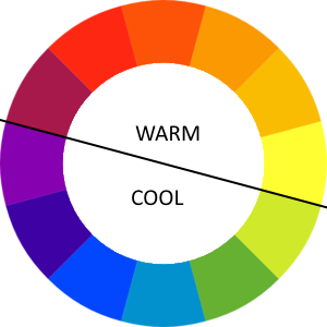
When you cut this circle from the center or draw a line in between, you will get the difference between cool colors and warm colors, which we discussed at the beginning of this article.
Tips for Selecting Right Colors for Apps
Understand your Target Audience
Color is a highly subjective matter. Everyone has a different perception of color. For instance, red is the color of love for some, while it is associated with many dangers. The designer must consider other important aspects such as users' culture and location when choosing a palette for app design. This will help to define how users can respond to a selected set of colors.
Make your brand a focal point
Your app's color combination should complement your brand philosophy and vision, helping carve a niche and stand tall among competitors. It is crucial to coordinate your brand philosophy and the color to interact with your brand. The perfect color and philosophy combination will itself act as a marketing tool for your mobile application.
Avoid overuse of colors
Try to have a mix and match of colors. Don't shy away from experimenting, but it is vital to avoid going overboard with your colors. Keep your color palette to a minimum of three for clarity.
Types of Colors to Choose for your Mobile Application
Source: Express Colour
Primary colors
At its most foundation level, the Primary Colors, Yellow, Red, and Blue, sit at the top of any color structure. These three Primaries are the original parents of all the future generations of colors.
Secondary colors
The next in line are the three Secondary colors, Orange, Purple, and Green. These three secondary colors can be considered as the children of the three Primaries shown above.
Fundamentally, secondary colours are obtained by mixing the primary colours.
Yellow + Red = Orange
Red + Blue = Purple
Blue + Yellow = Green
Tertiary colors
In the end, the rest of the six colors are referred to as the Tertiary Colors. You can consider them as the six grandchildren of the Primary Colors.
Color Theory teaches us that each Tertiary color results from one Primary Color mixed with one of its nearest Secondary colors. Therefore, we end up with a new color that stands somewhere in between both of them.
Yellow + Orange = Yellow/Orange
Red + Orange = Red/Orange
Red + Purple = Red/Purple
Blue + Purple = Blue/Purple
Blue + Green = Blue/Green
Yellow + Green = Yellow/Green
Now that we understand the most basic workings of colors and understand the selection of colors in web and app design.
Red
The Color red promotes the emotion of importance, power, and youth. Also, they are commonly used for warnings and important notices. It represents passion and power. Using red is not always advisable as it can incite anger or at least overstimulation. That is precisely why they have used it sparingly or at least in a lighter shade.

Orange
Orange is a highly vibrant and energetic color. It can be associated with the earth and with autumn. Since it is in with the changing seasons association, orange can represent change and movement in general. The color also represents creativity, as well as health and vitality.
Blue
Blue is used extensively to represent calmness and responsibility. Light shades of blues are found to be refreshing and friendly. The darker blues, on the other hand, are more robust and reliable.
The dark shades of blues, like navy, can be excellent for corporate sites or designs where strength and reliability are essential. The color also invokes trust and power in their users.
Conclusion
In this way, one can easily consider the effect of colors on users' minds before they opt for iOS application development services or Android application development services. You do not have to be Picasso or Michelangelo before you start building a website or an app. However, a prior understanding of the best colors for apps can be a prerequisite for web design.
Do you think you have an app design that can attract the right users? Let us know and we will design an aesthetically pleasing app for your business.
Color Psychology In App Design
Source: https://www.hiddenbrains.com/blog/colour-psychology-how-to-pick-the-right-colours-for-your-app-design.html
Posted by: thalerpappin.blogspot.com
0 Response to "Color Psychology In App Design"
Post a Comment